Believe it or not, accept it or not – your space is a manifestation of your mood, state of mind, your values, and way of thinking, and in return, the space you find yourself in affects your mood and state of mind. Your space is a reflection of you – that can’t be denied – even if you live in a home that is far from your dream home. Even if you live in a temporary, small rental that seems impossible or pointless to design or decorate, there are still numerous (and inexpensive) ways to improve it. You would be surprised by the evidence we have gathered over years of research on how spaces affect us.
Of course, your space isn’t the most important thing in the world; it is a bunch of material things, and you will probably agree that life is more than owning things, admiring them for their beauty, and obsessing over aesthetics. There are so many other more important things… or are there? In the long run, we’re all dead. However, while we’re still here, why not have some fun?
I am an interior design freak, and I am not ashamed to say it. I am so crazy that I have spent way more money, time, and energy than I should have on many spaces I have inhabited in my lifetime. At times, I regretted it, but regret didn’t do much; I kept going. (I have done many makeovers for others, as well.) This last project is what I consider my forever home, so I often use that as a justification for redoing things until I can no longer stand. However, I don’t really need a justification.
Is there such a thing as a perfect home? Probably not. Even if there was, most people couldn’t afford it. Even that perfect home would have some downsides, I am sure. For example, maintenance costs. Does living in a perfect home even matter? Not really. Still, I love improving the space I live in, and I love to help others do the same with their spaces. If there is really no divine purpose or importance in any of it, why do I keep doing it, you might ask. Because I can’t not do it. (Robert Sapolsky will confirm this; just ask him why people do what they do.)
I will share a few makeovers I have done in the past few years that I remembered to photograph. These are real spaces I designed using what I had and the time I had. The most recent one is probably my favorite, so I will start with that one.
The interiors you will see here are real spaces; they were not staged for the photoshoot. I created them for real life, and this is what they look like every day.
Let’s start with my favorite and most recent one:
Pretty Good: “The forever (ever-changing) home”
When I got this place, it was a disgrace. Seriously – and I will show you the pictures, so you will see I am not exaggerating. Everything was builder-grade, cold, completely flat; nothing was interesting, beautiful, or designed. It didn’t feel like anyone had ever lived there. (Later I found out the former owners spent very little time there, and that made sense!)
The space itself was OK; it was large enough. There were gardens, which was good. It had a lot of potential. However, I knew I’d have to move walls, break them, close some doors, open new ones, and paint, design, and decorate like a maniac. And I sure did.
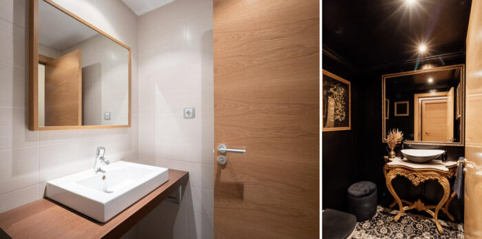
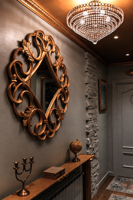
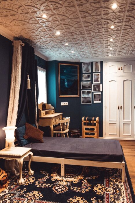
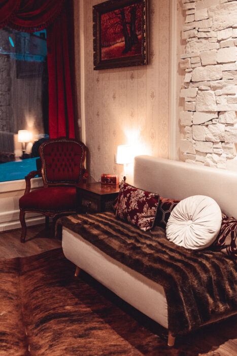
I know a few fellow expats, and many of them share similar tastes: old world charm, Victorian, neo-Victorian, eclectic… good stuff. The exterior of this place wasn’t really a townhouse; it wasn’t an entirely mountain home either, but it kind of was… a little. Stone facade and wooden balconies… You get the picture. I had to keep that in mind – the exterior and the interior should not collide and hate each other; they should be in harmony as much as possible, in terms of colors and style. This was a big challenge. I cannot live in a rustic home; although such homes can be cute, that is all they are for me – a cute weekend house where you spend no more than a few days a month. But to live in it 24/7? It’s just not for me. (There are also some other interior design styles I love to see in photos, but not live in them!) I had to be careful, though, so I included several rustic elements like cow/sheep hides; I kept the wood everywhere (I LOVE wood)… and that was kind of it. The problem was that the interior, as I found it, apart from being terrible, didn’t even match the exterior. The interior was trying to be contemporary, but it looked cheap, unfinished, undesigned, cold, and completely incoherent. It was BAD. Ugly grey tiles were in all the bathrooms and on the kitchen floor. The lighting was a disaster. The interior doors were ugly, and still are (I will change them as soon as I can. For now, I only changed the handles, and they already look much better).
I was surprised by the collective lack of taste, as if the whole country were trying to become Tokyo-like (while still preserving some of the beautiful, traditional stone buildings that are, luckily, protected and cannot be altered). (At one point, I realized that style is not something you see often in this otherwise naturally beautiful country, and I had to outsource absolutely everything – furniture, mouldings, and antiques. I made the art myself, so that wasn’t much of a problem. I shouldn’t judge anyone for a lack of style. I should judge them for other things, but I’ve learned not to! Or so I believe.)
There is just one category of people that I still choose to judge, even though I know it is pretty stupid of me. A few times, I have seen the look on the faces of “rich wannabes” who still don’t understand that money cannot buy taste, staring at some of my interiors, looking confused. They thought a Chesterfield sofa was “old,” “outdated,” and “no longer trendy,” and that is probably the safest way to get me to think very badly of you: be obsessed with Instagram trends + speak badly of the Chesterfield sofa. I mean, what ARE you?! An ugly grey bulky couch, no matter how expensive, will never, ever have the status of a Chesterfield, or its beauty (I know what you might say, but no, beauty is not always subjective. There are a few things about it that can literally be calculated!)
Don’t get me wrong – contemporary interiors can look great, and I love many of them. But they need to be done correctly. There are many ways for lovers of contemporary style to get it right, and it often involves an antique or two; it usually includes warm, honest materials and a few timeless pieces that don’t fall into any “trend.”
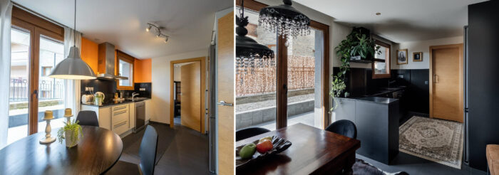
I am a fan of everything Victorian; I love Art Nouveau, I also love Ralph Lauren interiors, dark academia – even light academia aesthetics; I also love it when people incorporate some of those elements in their contemporary-style homes. Obviously, I lean more toward the traditional style, but now I had to add a touch of modern (I had no choice – the building is not old enough!), and then just keep doing the endless and exhausting voodoo to make it all look and feel harmonious, functional, coherent, and pleasant to live in. For some reason, I kept the black counters and backsplash in the kitchen, but I shouldn’t have. Now, for cohesion, every room has at least something black – and I don’t hate it, but I would not have chosen it if I were to start again.
The thing is, you don’t get it right the first time—perhaps not even the second. There is always plenty of trial and error, testing and experimenting, being happy for five minutes only to realize that it is all completely wrong…. I have been there, too.
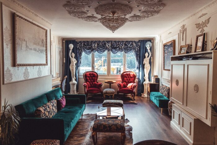
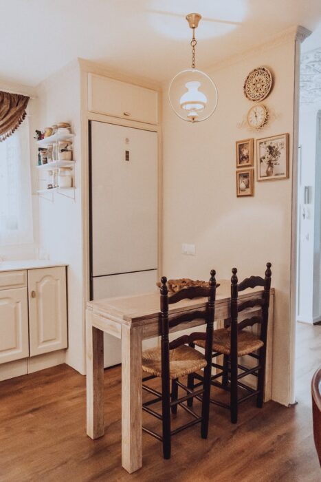
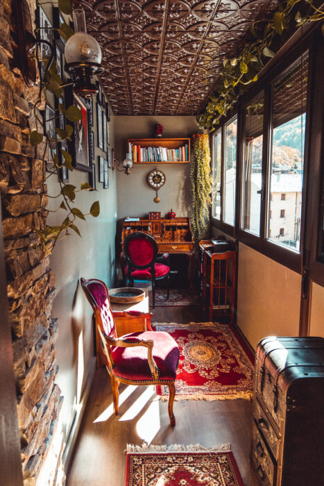
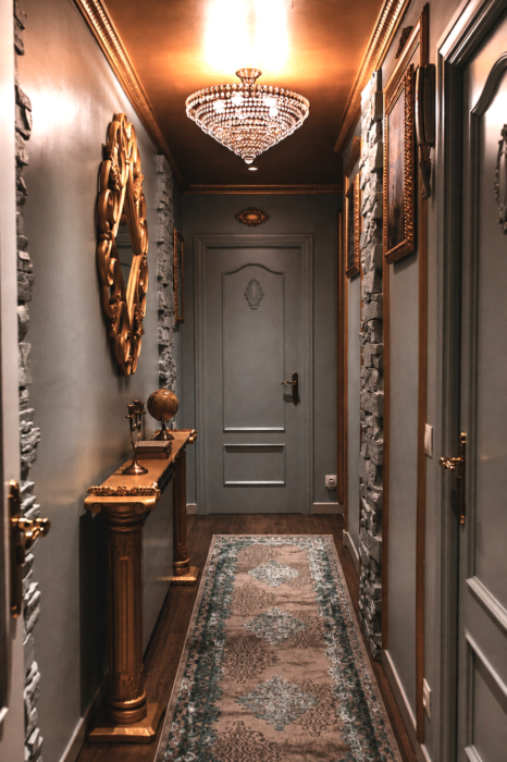
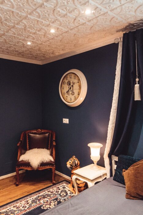
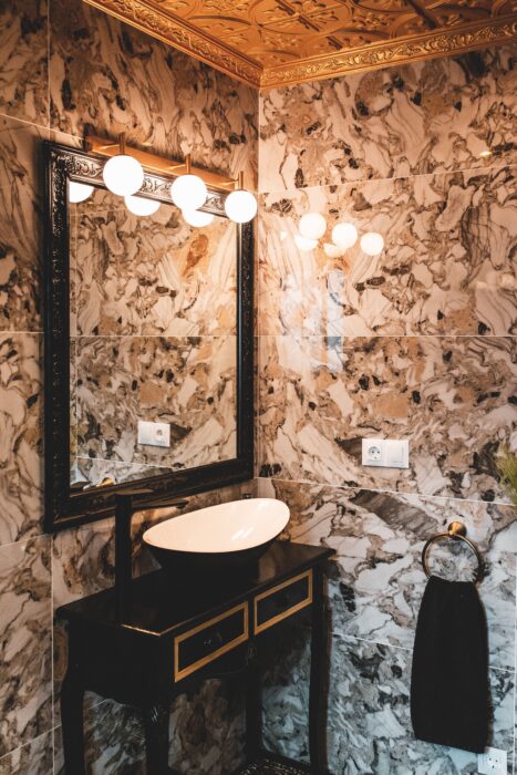
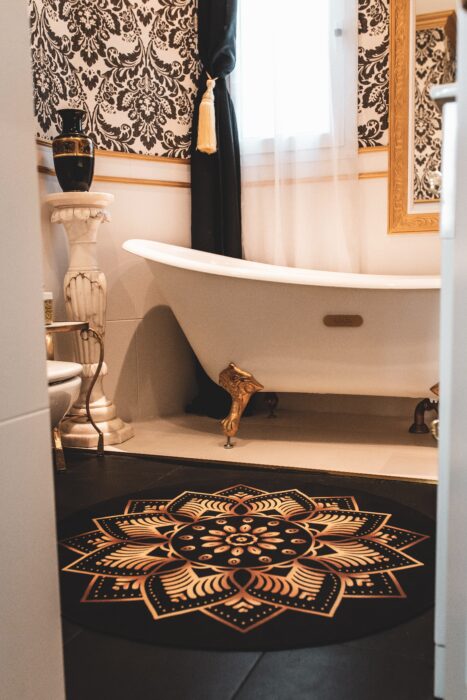
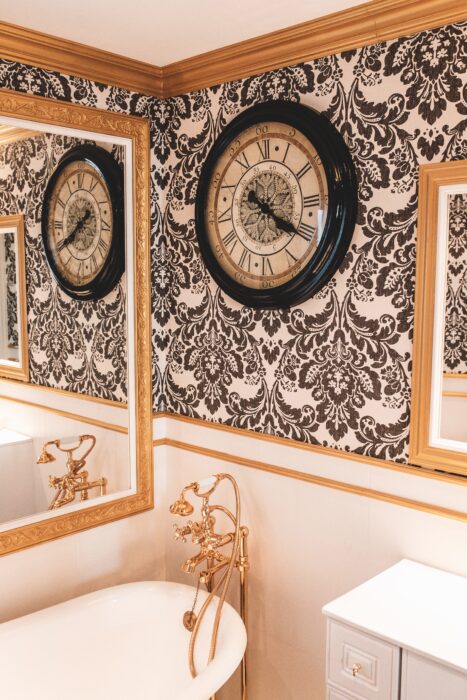
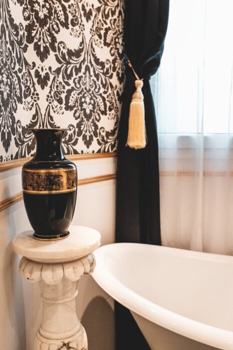
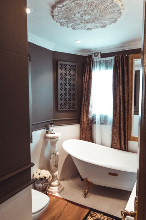
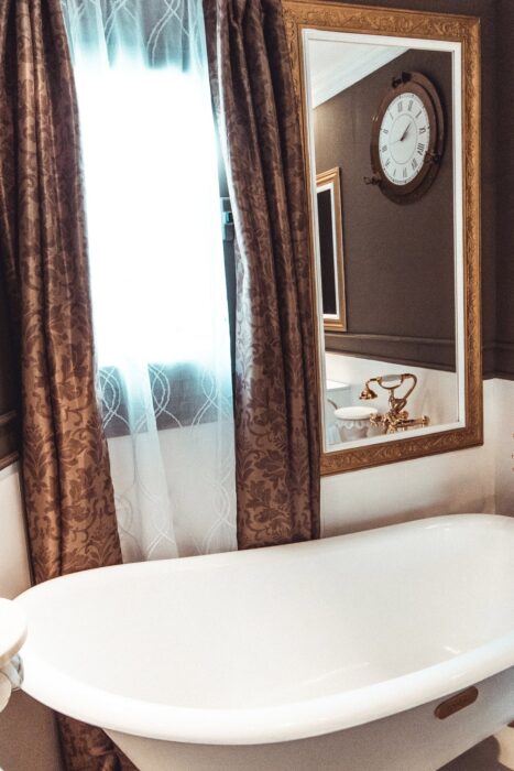
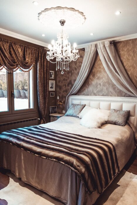
Some of the rooms now:
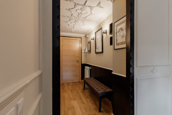
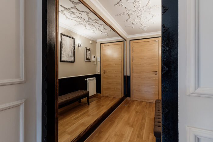
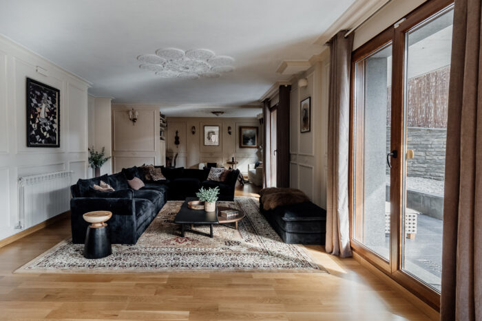
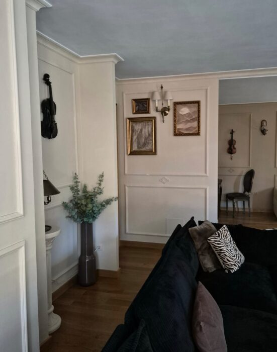
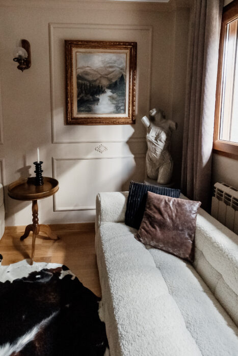
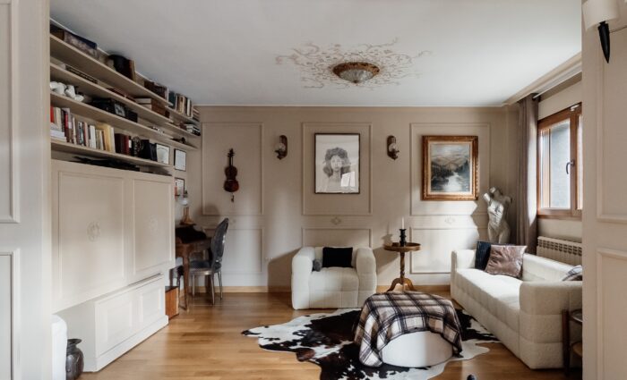
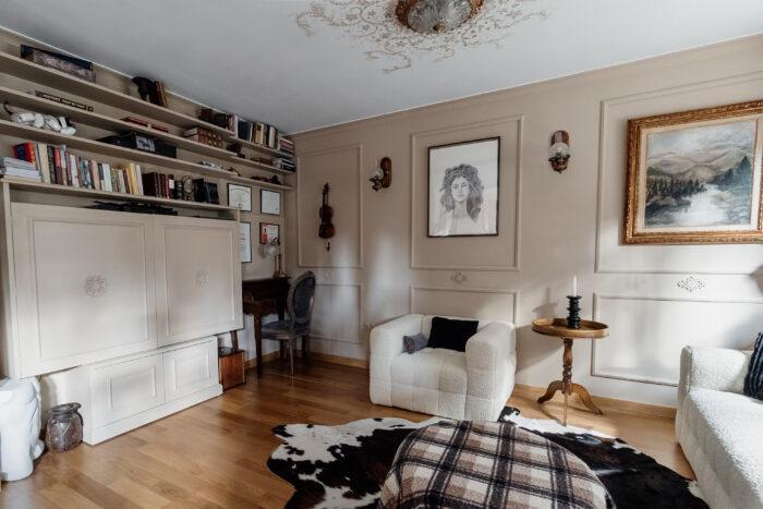
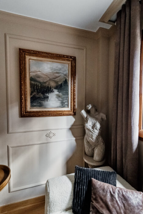
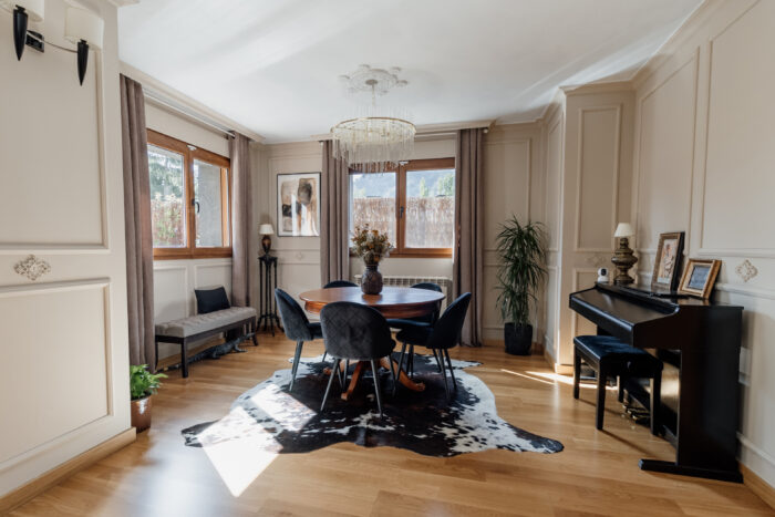
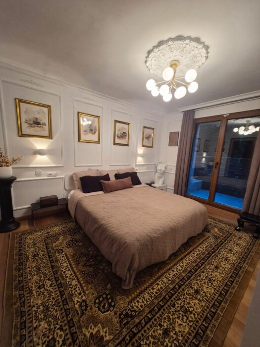
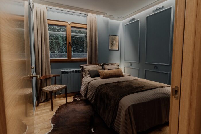
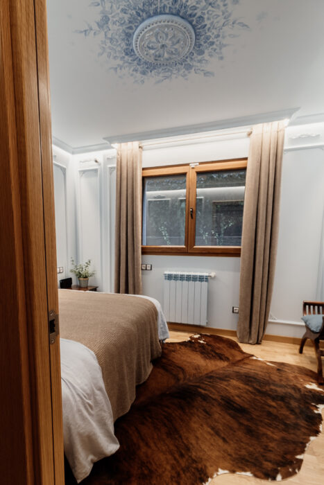
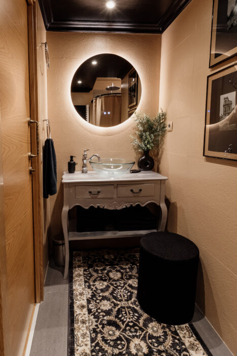
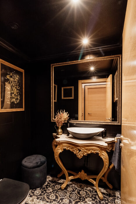
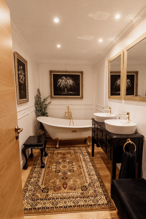
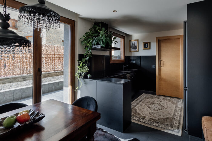
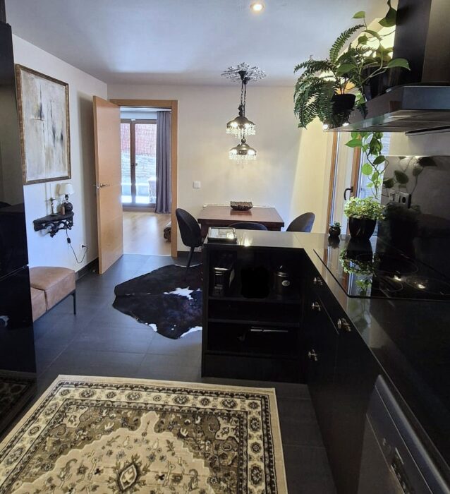
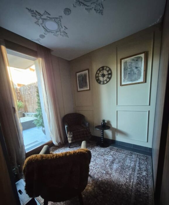
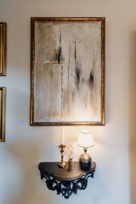
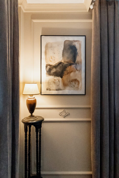
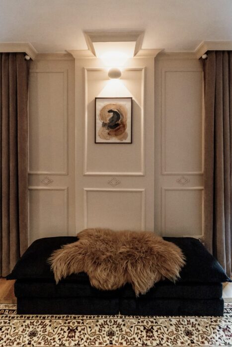
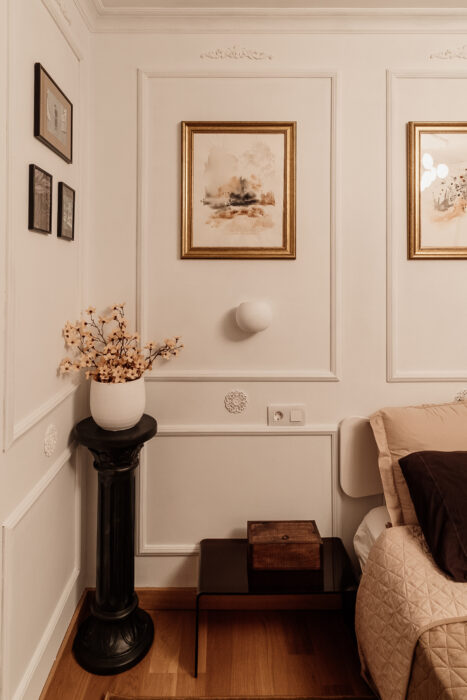
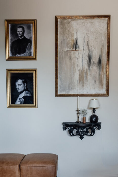
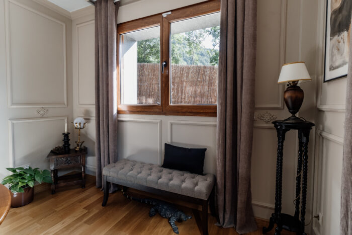
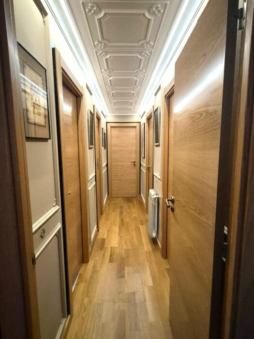
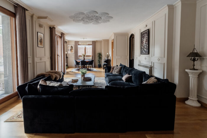
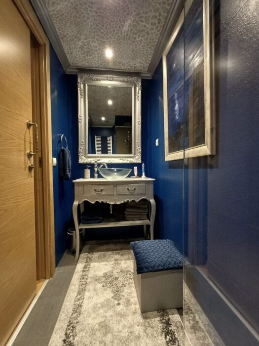
I have experimented with some of the spaces, and here are some variants I tested before:
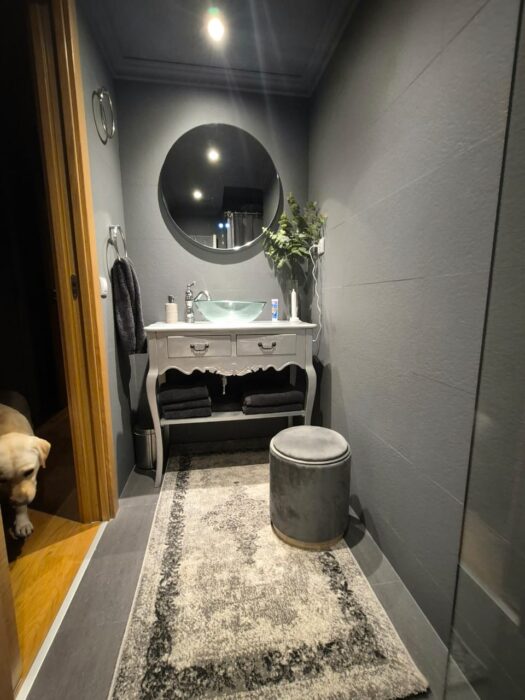

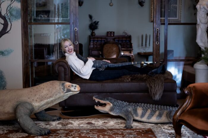
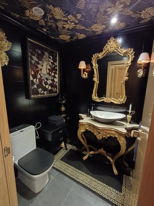
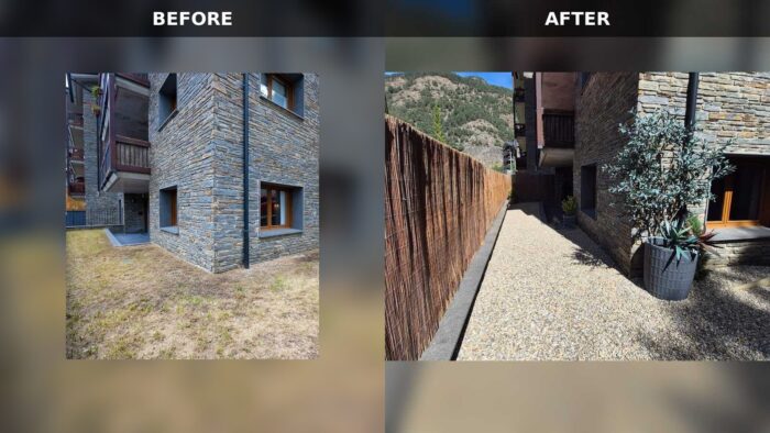
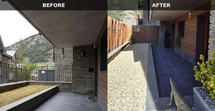
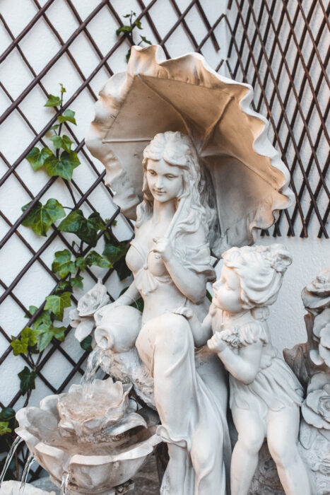
Parts of the exterior:
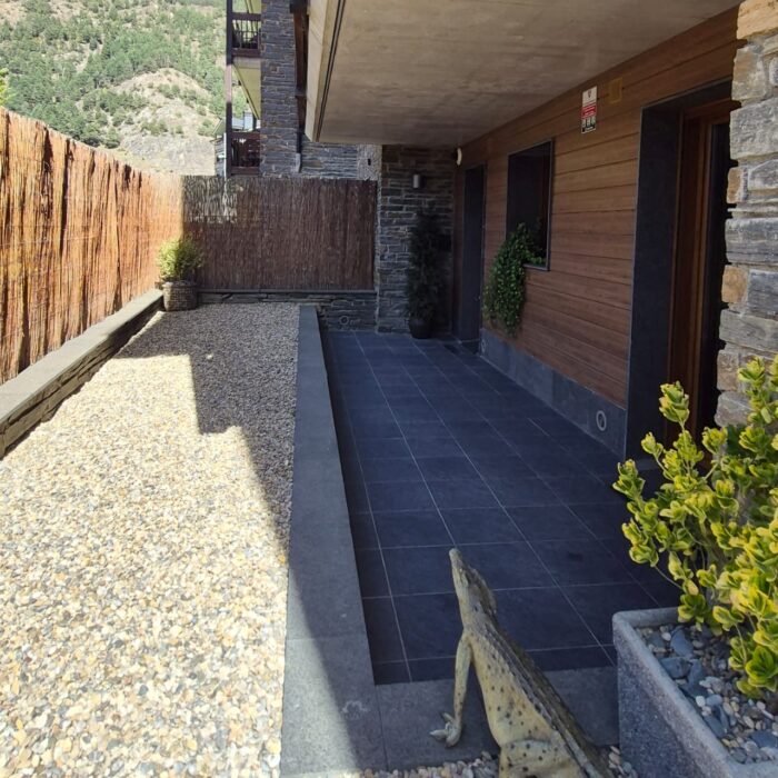
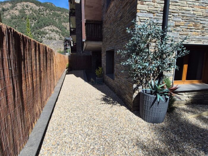
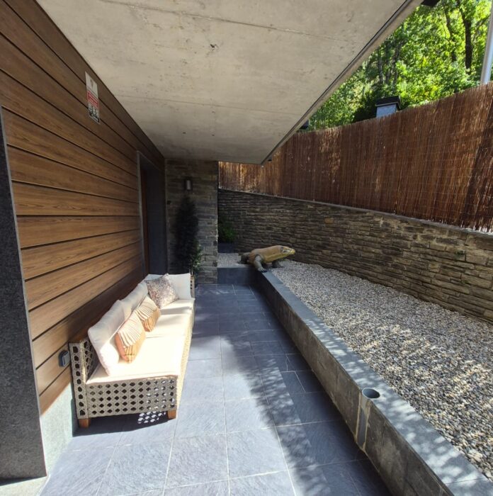
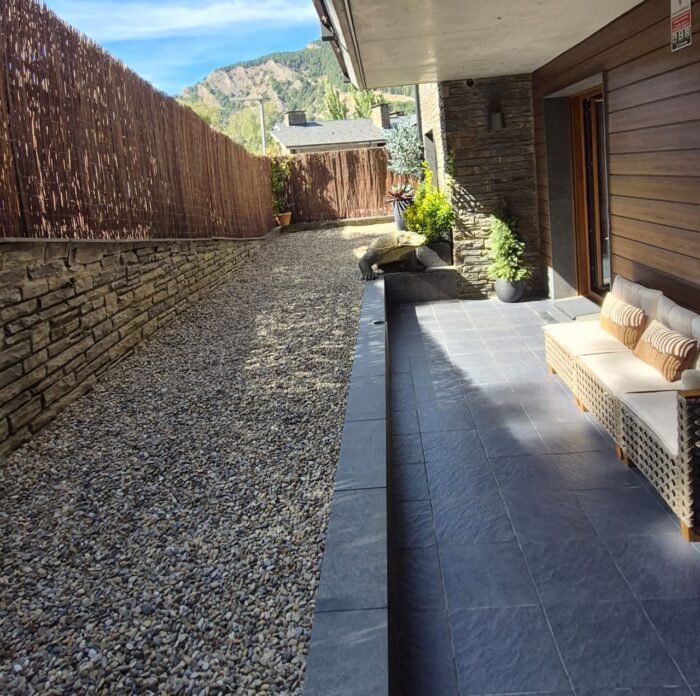
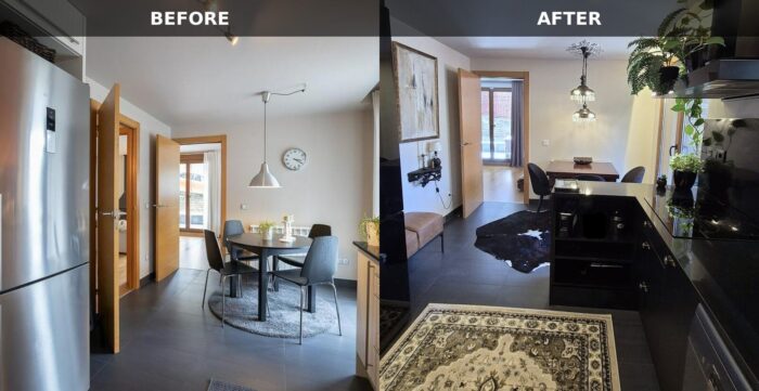
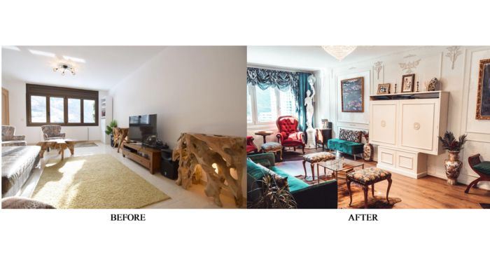
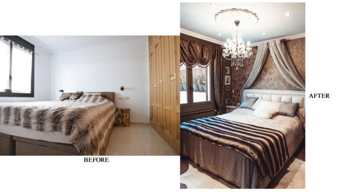
The place did not always look like this. Not even close! Look at the before and after photos:
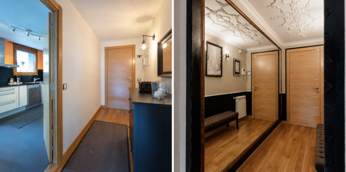
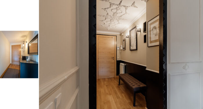
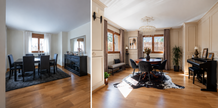
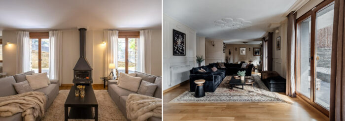
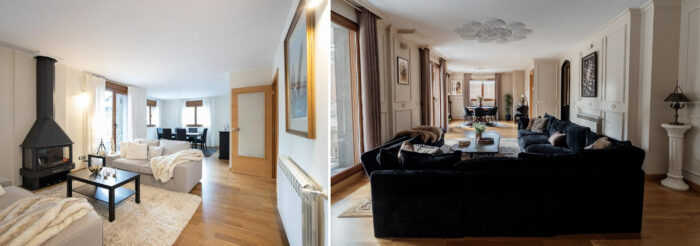
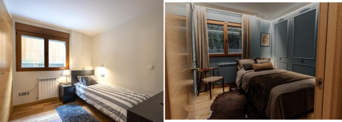
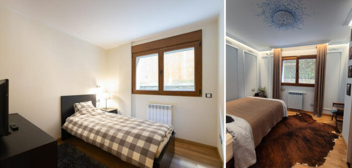
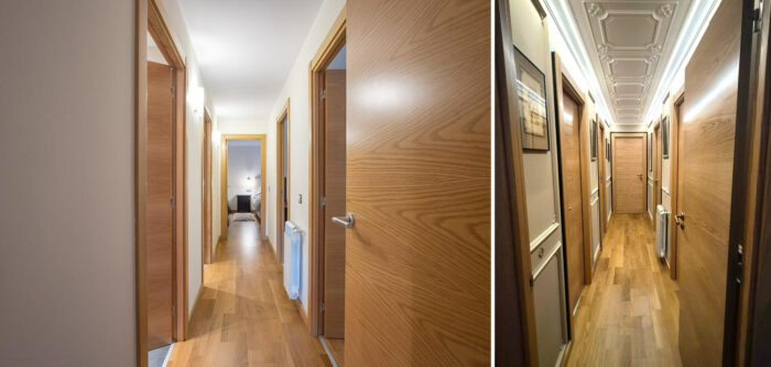
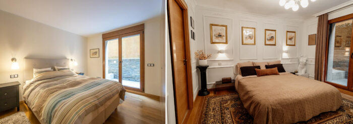
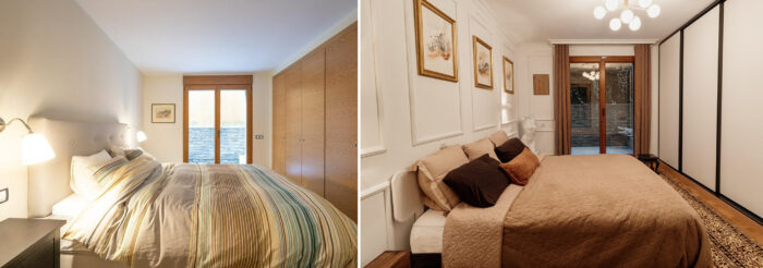
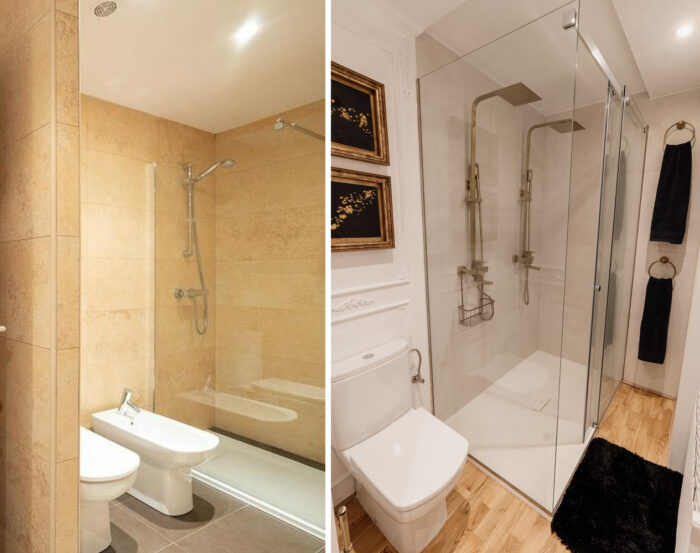
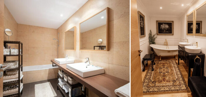
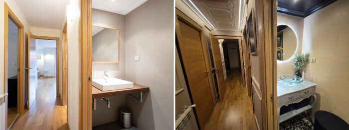
And last but not least: the kitchen that will forever puzzle me.
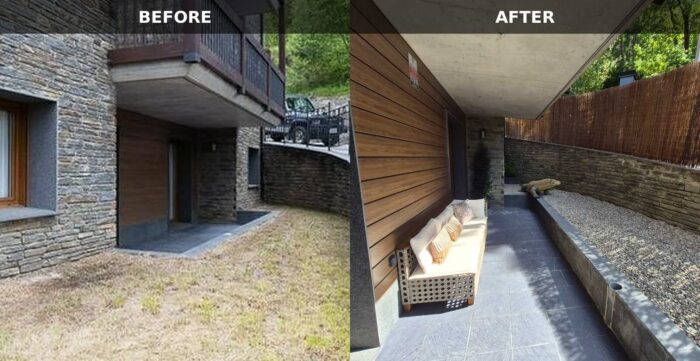
The exterior: before and after
Imperfect but fun: I like to call it ” The Minimalist’s Nightmare”
When I first moved into this place, I hated it. It wasn’t a bad purchase; it was just the wrong one. I hated the layout, the materials, and overall… I disliked the feel of it. I spent three years trying to make it at least fun. I knew I would never be able to fix some issues, like narrow hallways and ceilings that weren’t high enough for me (nothing ever is, to be honest). Still, I knew I would live there for at least five years, so I thought to myself, “You better start fixing this, or you will go totally nuts.” And I did. I mean, I started fixing it, not going nuts. Well, maybe a little. It took me a year just to figure out what I could do there without making it look too weird. It was an older building, but not old enough for me to love it. It was a 40-year-old building, meaning it had all the worst features you could think of (materials, colors, layout – you name it). When I moved in, I brought some of the very rustic pieces of furniture from my mountain place. I also am not a fan of rustic, truth be told. I find it too “raw”, and more suitable for a weekend place than a “serious” home. Rustic can look good in small doses; that is, at least how I feel about it. This was located in the city, so there was no need for anything that rustic anyway. That was the good news. The bad news… it was all very ugly. Perhaps that was the good news after all; I had nothing to lose, so I went wild.
Here are some “Before and Afters”:
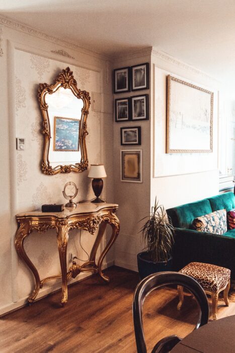
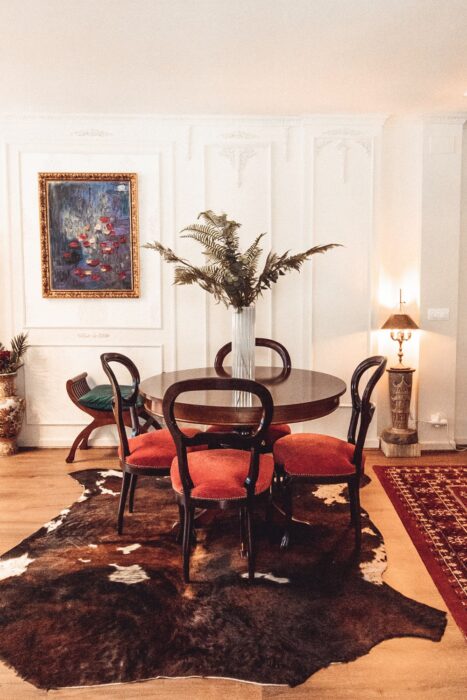
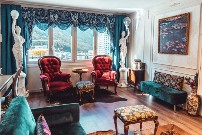
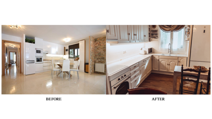
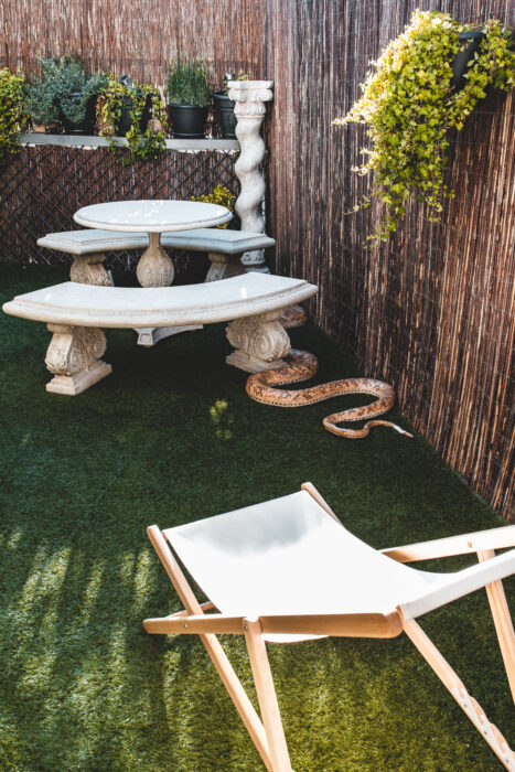
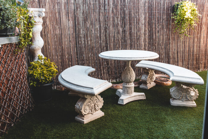
A low-budget makeover
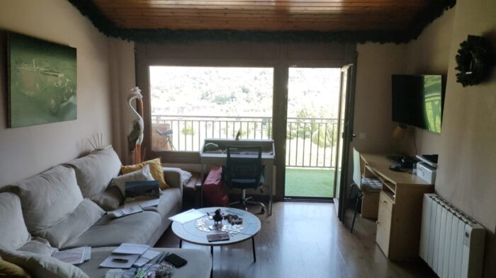
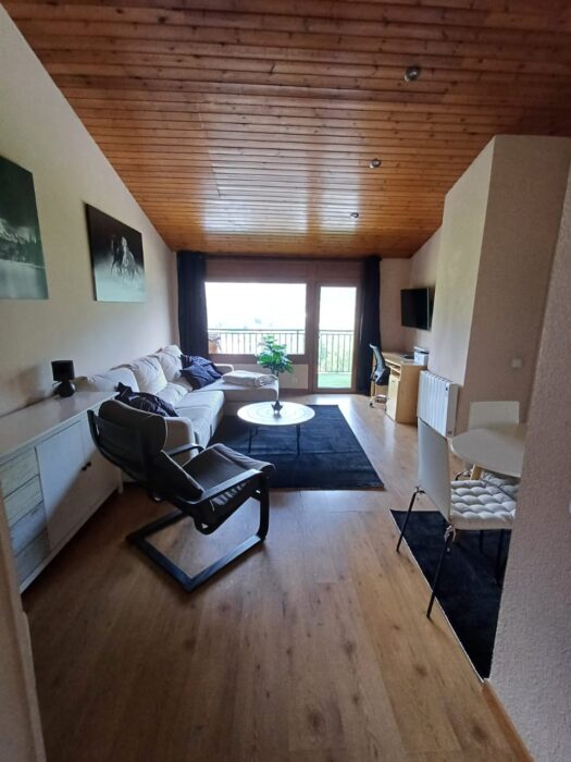
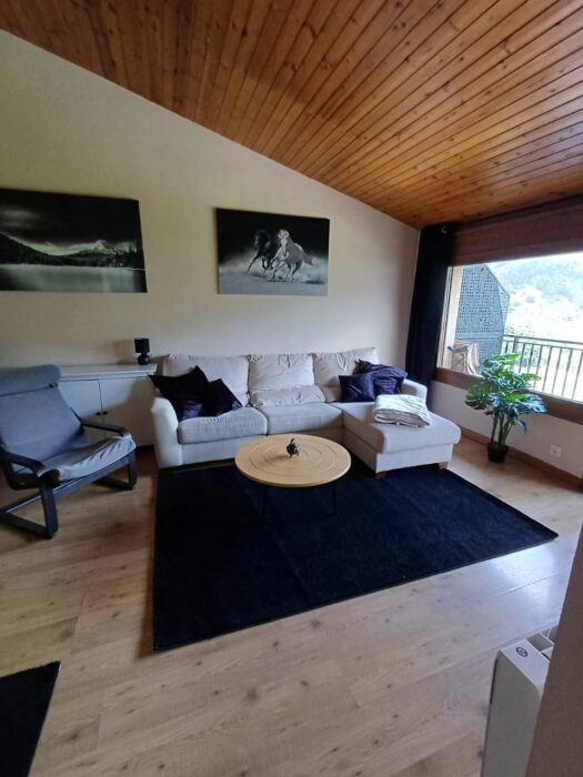
This time, I helped someone improve their space using the things they already owned. The only things that were bought were the rugs, wall art, and the drapes. The rest was already there. They wanted a masculine and minimalist space with lots of contrast and virtually no expenses.
BEFORE:
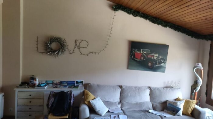
AFTER:
Sad spaces
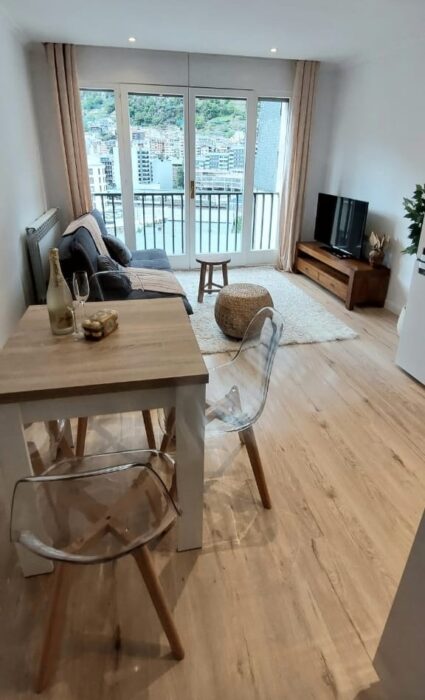
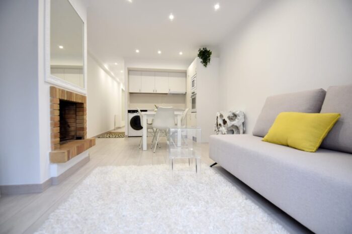
The spaces you are about to see look undesigned, although they were, in fact, designed specifically to appear impersonal and basic. They are the rentals I “designed” for future tenants; people seem to love the blinding whiteness, cold surfaces, and rough edges. I call them “sad spaces”; the sad part is that small spaces can easily be made cozy and interesting, but for some reason, people prefer it this way:
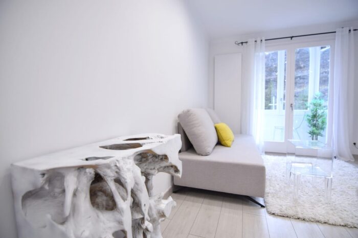
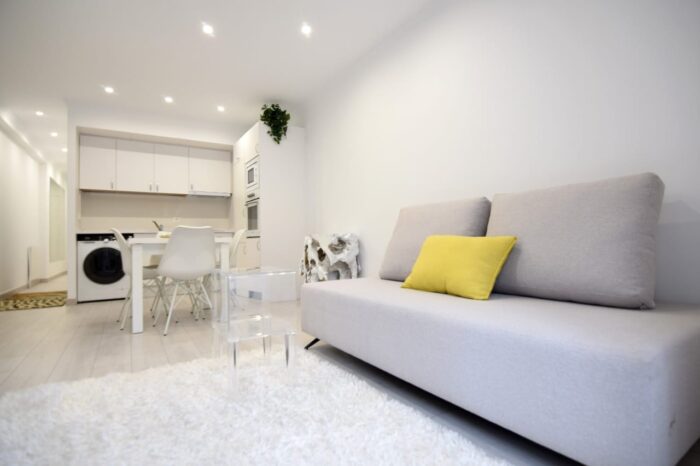
Another one – an attempt to add some texture and hoping they would not mind: